Since its launch back on 27th May 2003, WordPress has led the global CMS market. Today, it boasts of powering over 60.4% of CMS sites on the internet. So what does that say about WP? For one, WordPress Website designs are adaptive to the changing user preferences and preempt their needs.
WordPress is entirely living up to Darwin’s sayings of “survival of the fittest” and “struggle of existence.” Both of which underscores the importance of bringing the ‘A game’ each time, all the time.
For the year 2020-2021, WordPress has released yet another round of upgrades and features that made headlines. This article is going to explore some of the top trendy WordPress new features:
Trendy WordPress Website Designs
Without many blurbs, let us dive right into it:
1. Improved Block Editor
These days, the threshold for web designing has been lowered to such an extent that anyone with zero coding skills can craft up a gorgeous-looking, mobile-ready, and responsive website. Thanks to the Website Builder tool, they can do all that without writing a single line of code. WordPress has also joined that bandwagon with the release of Elementor and Beaver Builder.
WordPress has released an equally convenient tool for the editor: the Block Editor. Released in 2018, this tool has just been integrated into WordPress’s core. The new full-scale Block Editor replaces the TinyMCE-based editor, which was the default editor for WordPress.
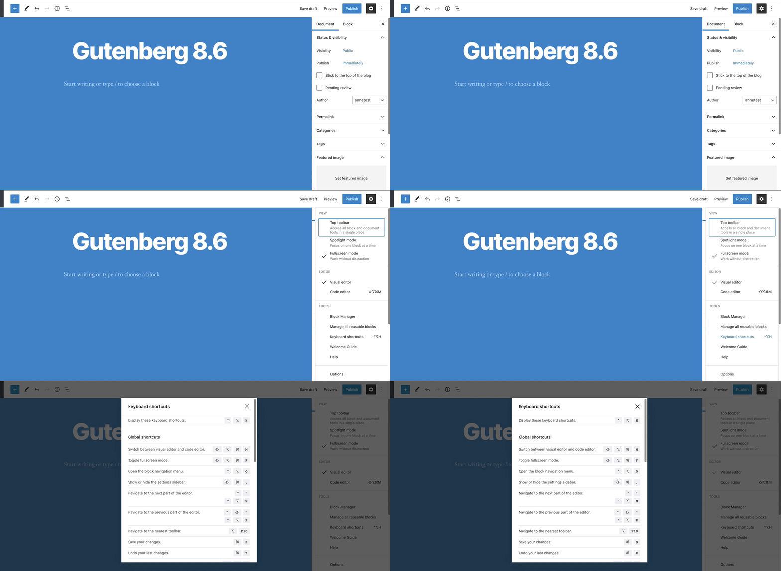
Although it is far from a website builder, the new Block Editor comes with some drag-and-drop features that allow users to customise posts and web pages. You will not, however, be able to customise the themes. Nonetheless, it has taken the cue from builders and now making the WordPress editor more user-friendly even to the most non-technical users.
2. Less-Is-More Design
You might have noticed that slimming down design is the current thing. A minimalist design focuses on simplicity using flat colours, conciseness, and lots of white spaces. This slimmed-down design is excellent on at least two fronts:
- The site has fewer whistles and bells, thus putting the content at the centre of attention.
- The site loads faster
- The site looks great across various devices
WordPress website designs, too, have adopted this minimalism revolution. You can see that in various WP themes such as:
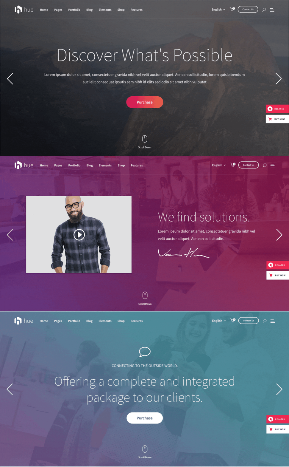
Hue
This theme uses large, clear fonts and a gradient colour scheme.
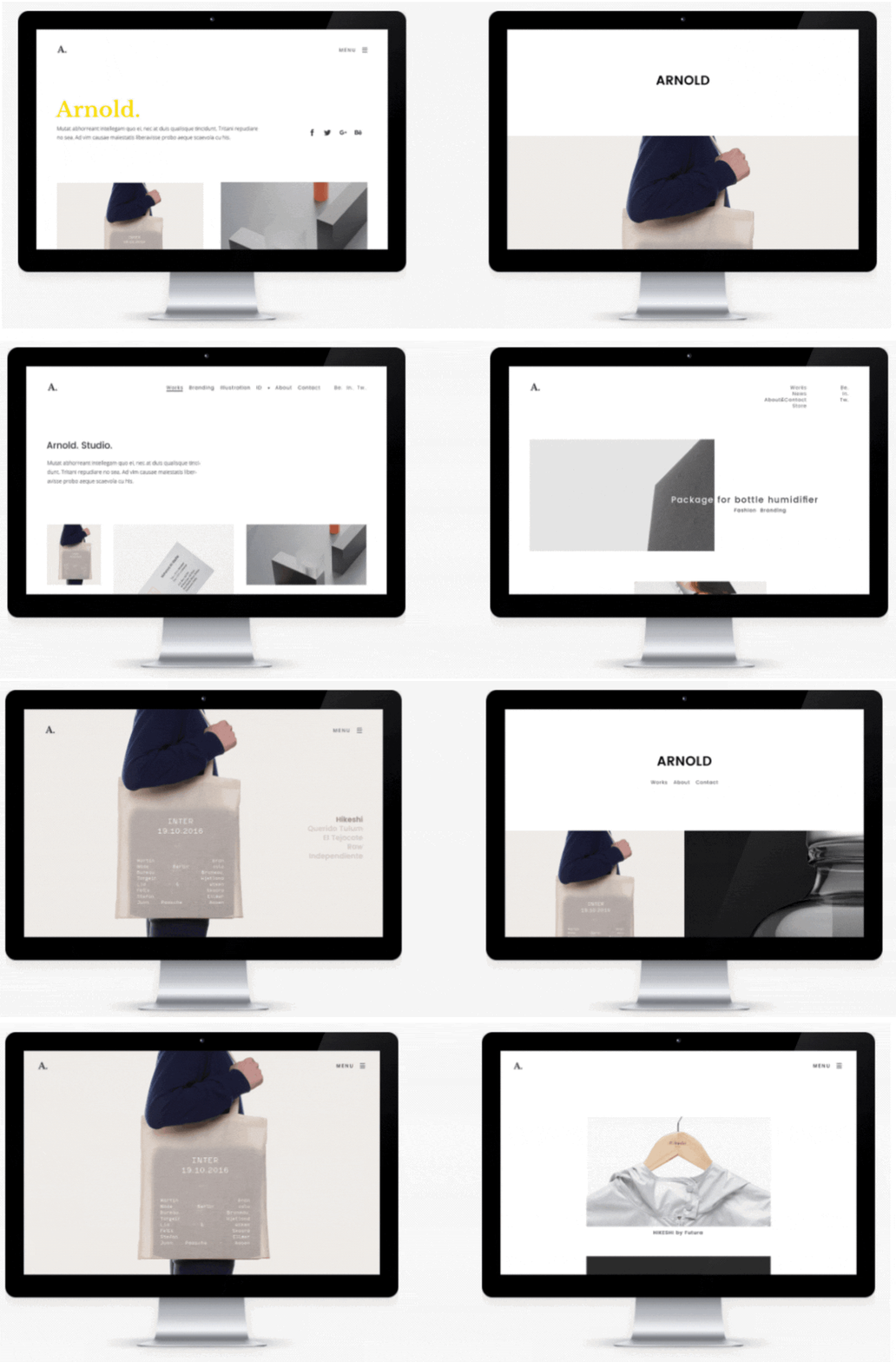
Arnold
This theme has been praised as the ideal theme for creatives. It makes good use of white spaces to let the texts and images pop up
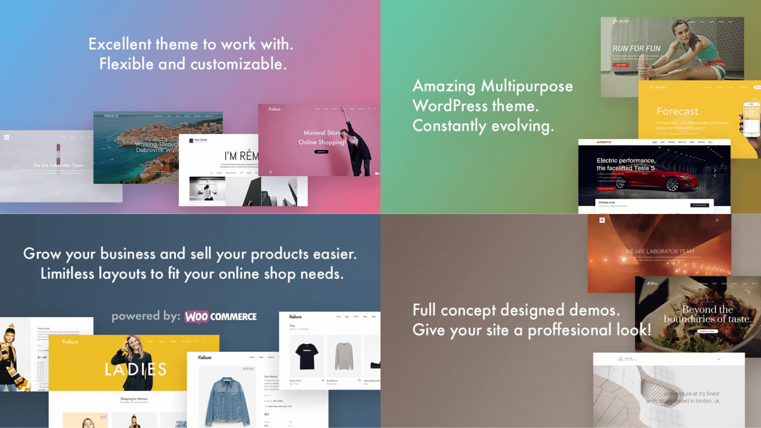
Kalium
With full-width headers, this theme also has a minimalistic design that puts the focus on the photos and videos
3. Saturated Vibrant Color Scheme
In the old days, web designers were limited to just using variants of the black colour in order to highlight content. These days, it is trendy to use high saturated and vibrant colours to make things pop. Buffer says 90% of the assessment people give on a product is based on their colour. That means your choice of colour scheme can significantly impact how your website and brand are perceived. Against that backdrop, it makes sense that using conspicuous colours will make your website stand out.
On this front, developers working on the WordPress website designs have also adopted saturated and vibrant colour scheme designs. For instance, in the WordPress themes mentioned below:
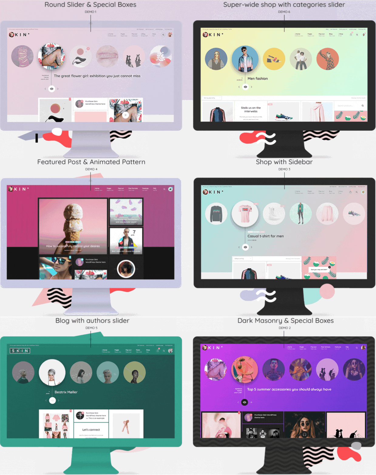
Skin theme
You get to choose between two colours, and from those, a gradient scheme will be created across the entire site. You also get to pick your gradient, pattern, and texture.
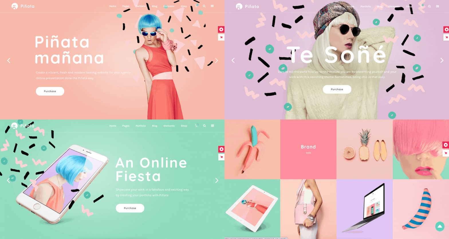
Piñata
This theme comes with a customizable vibrant colour scheme
4. Asymmetrical Designs and Broken Grids
You want your site to have all the necessary whistles and bells needed to force attention to specific content in certain situations. In such instances, minimalism and flat designs won’t take you anywhere. Instead, you need asymmetrical and broken layouts like in the themes below:
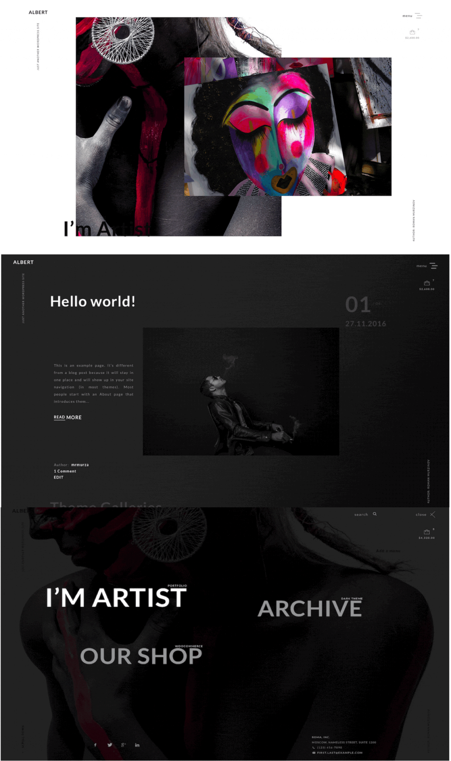
Albert theme
This theme uses sliding images and overlapping elements. It has a twisted design done deliberately with broken grids and asymmetrical designs to force people’s attention to the intended content.
Overlap theme
The Overlap theme achieves a unique look by using overlapping elements and a broken grid design.
Though admittedly, minimalism design is easy to pull off any time, all the time, you need to be careful with asymmetrical designs and broken grids. It is easy to find your site too uncluttered and unusable to the end-users. You have to tread carefully, or you might end up with a site too loud for anyone to understand how to use.
5. CSS Grids
It used to be that there were more people offline than those who could access the internet regularly. However, in the recent decade, things have changed, and this change is across the globe with the internet becoming readily available to the masses. For a long time, developers had to self-limit themselves in their web design choices by creating print-friendly websites. These days, with less and less need for people to print web pages, most developers feel they have acquired a license not to limit themselves and are now creating highly responsive websites.
Among the trendiest WordPress website designs is the CSS Grid design that creates sites that dynamically change depending on the device it is being viewed. They also vary in line with the browser window size, changes that can be viewed in real-time in the Kuhn theme below.
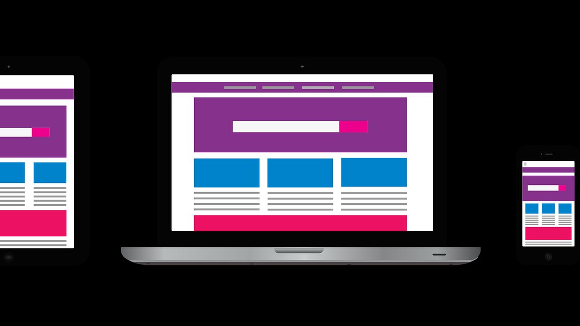
6. Mobile-Friendly WordPress Website Designs
The year 2016 marked the point in time in internet history when the number of users on mobile devices exceeded users on desktop. A trend that is still growing and appears not likely to reverse. This development called on web designers to not neglect mobile devices and had to start creating mobile-friendly websites.
On WordPress, you download the Google-recommended WPtouch plugin that automatically makes your site mobile-friendly. WordPress-recommended Elementor plugin is also another useful tool for this task. If you are building your site up, you can also use the Jetpack plugin that quickly creates mobile-friendly websites.
7. WordPress Website Designs with Microinteractions
Microinteractions bring bits of information that go a long way in keeping a site’s visitors engaged. Like the Facebook reaction emojis, they are things like the short animations that play when you click or hover your cursor over them. They raise user engagement by making the site look less like a wall of information by adding nifty little interactions.

On WordPress, you can use the Animate It! plugin to add animation to just about any content on your site. That includes texts and images.
Another option is the Highlight and Share plugin that lets users share your content on social media using interactive social media icons.
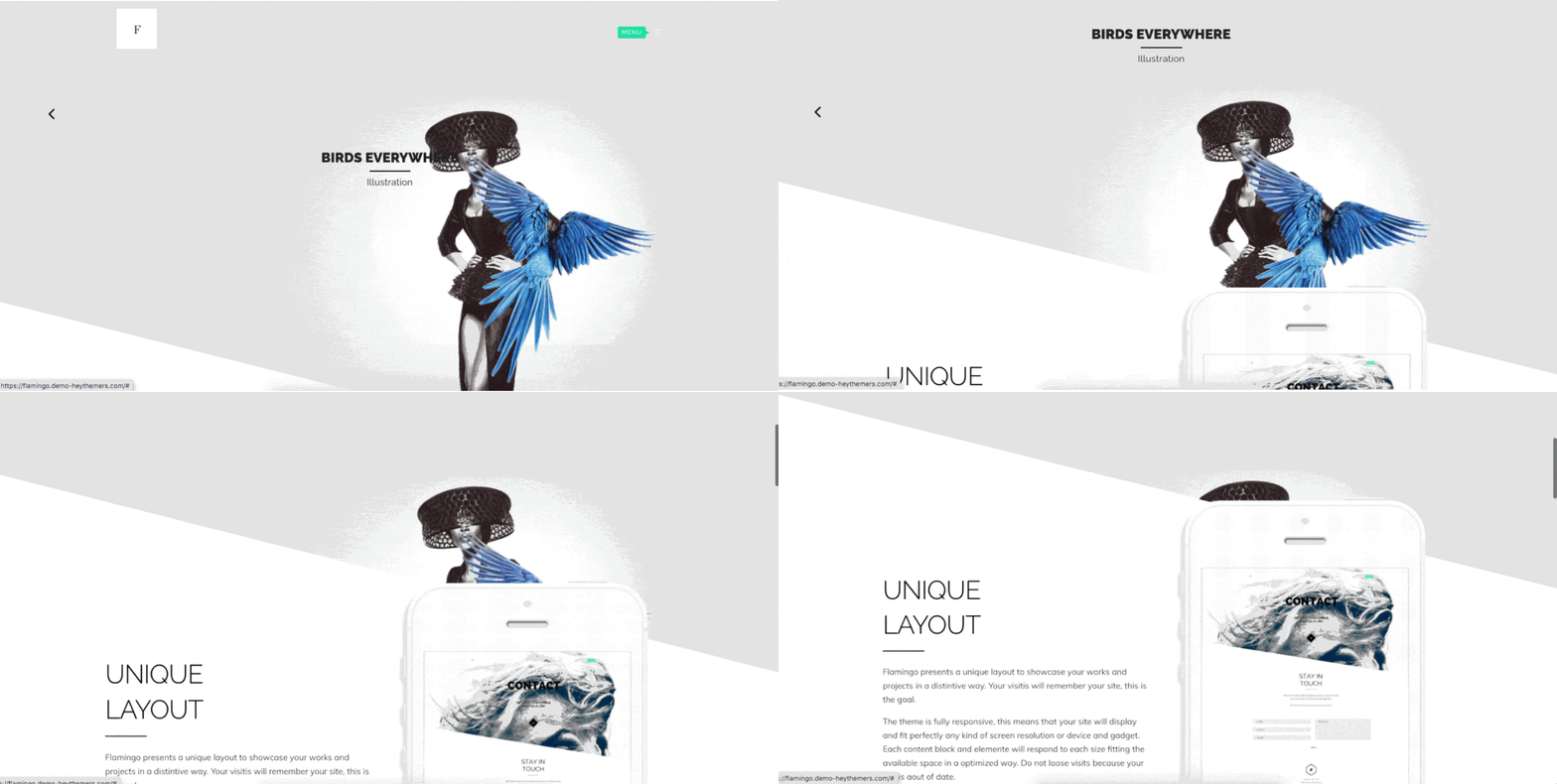
8. Slants and Diagonals
It might seem counterintuitive to design your site out of kilter, but then, why is the trend growing phenomenally across the board? For one, slanted lines and diagonal lines give a site a contemporary look and have been observed to encourage the eyes to scroll further down the web page. It is particularly ideal on a page where you want to achieve a striking visual separation between sections.
One WordPress theme that highlights the slants and diagonals design is the Flamingo theme.
Another one is the Upward theme, which uses the conventional grid layout, but with slanted lines for a contemporary look.
9. Big, Bold, Variated Fonts
Another trendy web design is the employment of typography, where you create impressive optics by using words to create art. It entails using large font types to create a tone for your site and have stylish headlines.
A good example is the Wedding Planner theme for WordPress. As you can see in the screenshot below, the theme uses big and bold fonts coupled with font variation to create a visual appeal.
The Retro Portfolio below shows us that creative fonts are not just limited to headers.
10. Customized Illustrations
When it comes to web content, that has traditionally been defined by text, pictures, and videos. However, a recent trend among designers is that of additionally using illustrations in the content as well. Illustrations give the site a unique identity and give the designer more room in terms of visual branding.
Not to mention, hiring an illustrator is much more affordable compared to a photographer. Especially when you consider a photographer might need to travel out to the fields to get new pictures. The main things to pay attention to when designing a website with illustration include having a full-width design layout. This design better showcased the illustration images. An excellent example of a WordPress theme that correctly works with illustration is the Illustrator theme.
11. The Dark Mode
More people are increasingly spending extended time on screens. Be it a desktop computer, tablet, or smartphone screens. The glare and the light from all the white spaces on websites can lead to poor eye and general body health if gazed upon for a long time; things worsen if viewed in a dark room or at night. A new web design trend of dark mode seeks to address this problem by having visitors have a healthy experience while interacting with websites.
WordPress gives designers the option of integrating the Dark Mode plugin. Designers are also leaving it at the discretion of the visitor by enabling the option of switching between dark mode and light mode at a switch of a toggle at the front-end of the site.
Wrapping up
Taking a look at the new web design features available for WordPress. One can easily see why WordPress continues to be a market leader in matters CMS. The WordPress website designs are dynamic and adapt to the users’ changing preferences.
Then again, there are many details (both big and small), and their development sometimes happens overnight. Will you be in the business of running your business or keeping tabs on WordPress website design developments? That’s why we are here, with a team full of experts whose main task is learning how to pivot on each WP theme for any given business. Contact us today, and have one less thing on your business’s to-do list.





![Must-Have WordPress Plugins for Ecommerce [FREE & PAID] in 2022 cover](https://managed-wp.com/wp-content/uploads/2022/06/e-commerce_2e3c14853b0db424fdccac2ab3b14460_2000.jpeg)